-
Client
Reality Check Fit/ RC Fi
Project
UX UI Development
-
My Role
User Research, Ideation, User Journey/Flows, Visual Design, Wire Framing, & Iconography
-
Team
Arlene Santos- Art Director Karla Varela (Me) Miller Team- Dev Team
-
Tools Used
Sketch, Illustrator, Photoshop, Adobe Acrobat, Adobe XD

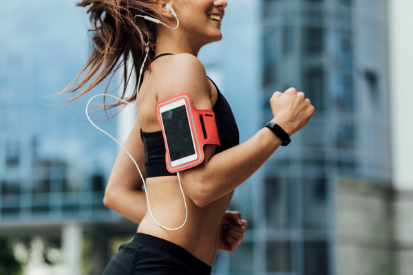
RC Fit
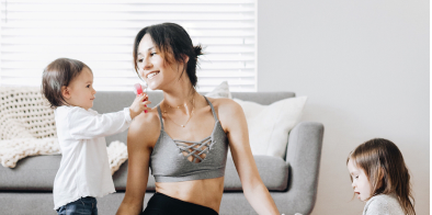
An app that provides personalized, on-demand wellness programs that caters to fitness and nutrition.
-
The Story
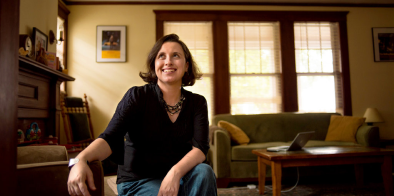
Heidi Hamels, an entrepreneur, actress, member of National Athletic Member Association, and a mother of four, was looking into creating a one of a kind wellness app. She wanted to provide personlized, on-demand wellness programs that caters to people with different life styles.
For those who want to lose weight Are vegetarian, vegan, gluten free, or dairy free dieters Travel often Expecting mothers: -
The Challenge
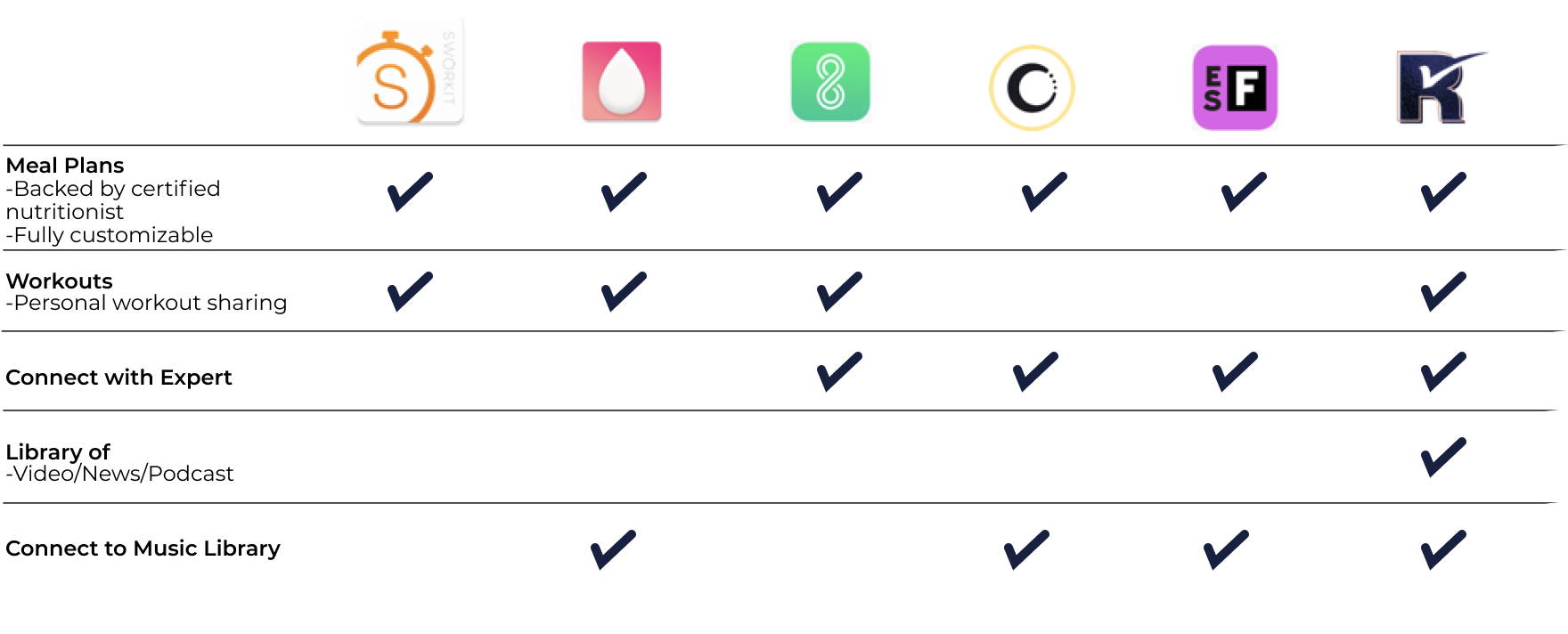
This is a one stop for wellness app that is full of resources for the subscriber. It doesn’t just help you with a healthy recipie for a meal. It helps the user stay on track of workout challenges, and guides them with video, blogs, and even podcast tailored to the users goal. It also helps them connect with experts when they need to reach out to the community in RC Fit. How do we make it easy to navigate throught all this content?
The process started by the discovery of the target audience. With help from the client we were able to narrow down our target audience, and have a better understanding of who our users would be. From there, we were able to research our competitors, and learn from them. This helped us better map out a user journey through the app when we started to wire frame the actions we wanted to give to the user. After narrowing down the basic flow of home page, we decided it to try different style treatments. We knew, that even though this app was very powerful and complex, we wanted to give the user a great, at ease experience.
Target Audience
During this period we learned who was our targeted audience. We wanted to appeal to: Primarly Woman between the ages of 25-65 Women who are moms, or are pregnant, tech savy
Proffessional Women between the ages of 25-65 Who value nutrition On the Go Tech Savy Need to simplify nutrition, workouts, health apps
Secondarly men between 25-65 Working proffessionals who are tech savy Who also value nutrition Want to simplify their workouts, meal plans , and health apps

Competitors
By studying the market place we were able to find out most app are very general with meal plans and workouts, but we wanted to break away from that. We knew we wanted to give an experience that was tailored for the user, and be backded up by certified experts.
User Journey
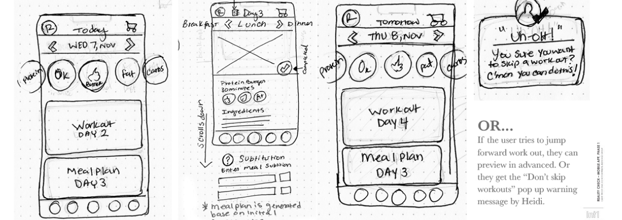
When I started working on the design work I knew that everything needed to be accessible. This was the challenge as the app had so many features the user would engage with daily. These were the sketches that made it onto the second face of wireframing.
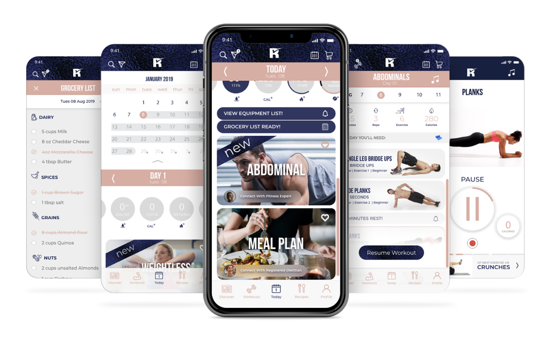
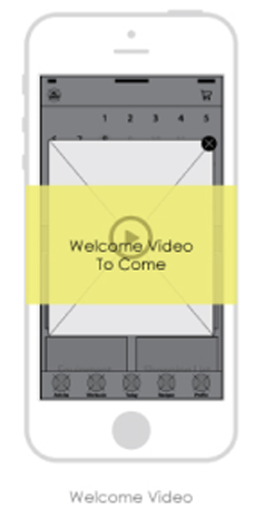
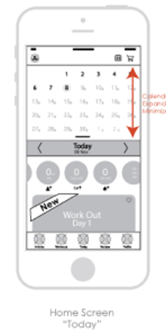
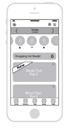
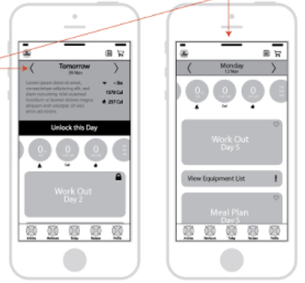
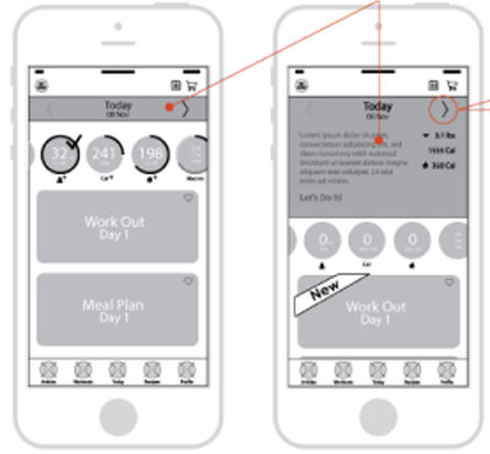
Wireframes
With my Art Director we first developed the functions, and tried to be creative in ways we would show the user the calendar, while also displaying the current day’s workout and meal plan. After much brainstorming I was excited about the calendar feature that allowed the user to jump around workout/meal plan days anywhere in the calendar while easily being able to get back with one button to the current day.
-
UI Proposal
I am happy the client had been very invested since the begining, and approved of the wireframes before we moved on to the look and feel of the app. When I did start this project, I did not work on the logo creation of the app which helped me apply those same design styles into 3 different looks for the client.
-
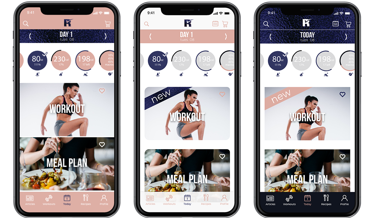
An easy to customize nutrition, workout, and health app. The client went with an option that is a mixture of the three that we originally presented. She didn’t want the pink to be too prominent so I used the texture from the logo on the top and for the banners. The pink as a secondary color was used for splashes.